Omera
A mobile app that helps customers invest and grow their money at every stage of their investment journey.

Project Overview
Client: Lefta Wealth (facilitated by Barclays & GCU)
Industry: Finance, FinTech
Timeline: 12 weeks (2025)
My Role: UX/UI Designer
View the prototype here
Lefta Wealth is a bank with a long-standing history as a traditional institution, with values that emphasize promoting positive societal and environmental impacts through the use of finance. They aim to be the a trusted and forward-thinking wealth institution, merging tradition with innovation to create inclusive, impactful financial experiences for every generation.
The brief
The challenge
Lefta Wealth wanted to create personalised experiences for every generation. They wanted to aim for the same success online as offline.
For whom
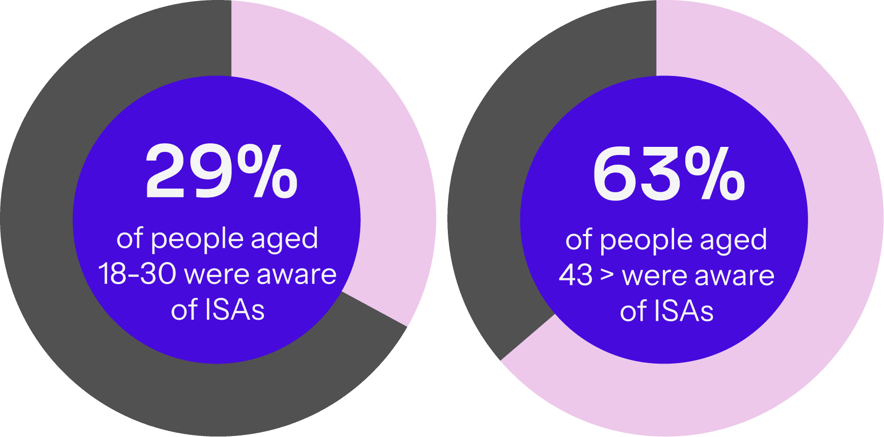
Lefta Wealth wants to inspire a younger target demographic (18-30 yr olds) to invest in ISAs more, whilst retaining their loyal older demographic.
Considerations
They want to satisfy and support a vast age range. Experimentation was welcomed.
Research
Demographic
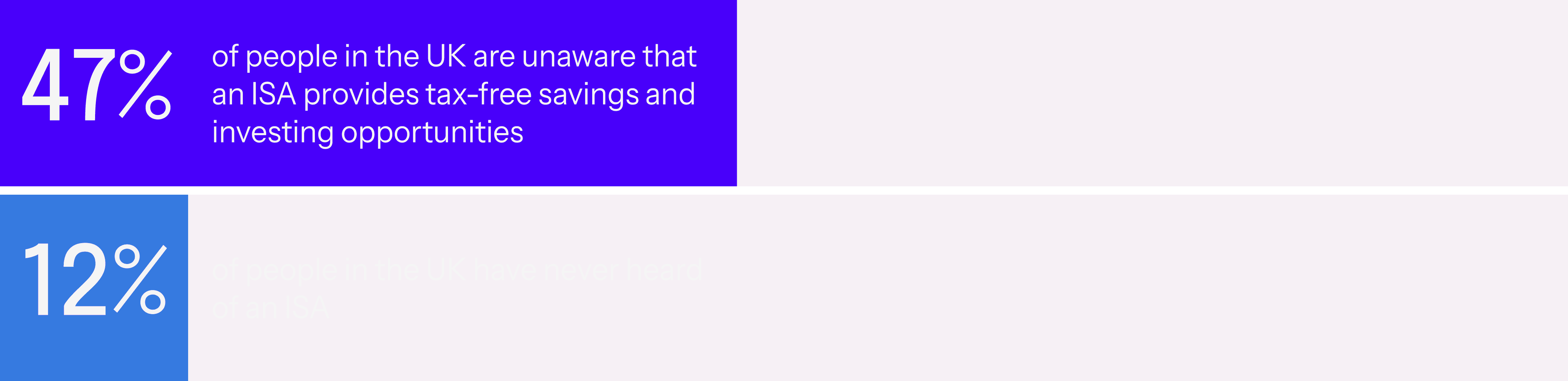
Research found that almost half (47%) of people in the UK are unaware that an ISA provides tax-free savings and investing opportunities. In addition, one in 10 (12%) have never even heard of an ISA. This was a big gap we wanted to tackle.
Gender gap
Unfortunately, there is a significant difference when it comes to men and women with investing. Usually, women have more savings than men, but take longer to (or don’t at all) invest. What stops women from investing is a lack of confidence and understanding through research, education and learning. Studies show, however, that when women do invest, they tend to be very good at it.
Competitor Research
The competitors that were researched were Monzo, Plum, Chip and Wealthify. Some keytake-aways from the competitors analyses are the following:
Focus on a strong visual language with good hierarchy.
Create a gamified experience that encourages users and feels rewarding.
Make sure give an educational option whenever people need.
Make sure there is an accessibility section or settings, where people can personalise their experience when investing.
There are many different features to explore; from gamification to referral schemes.
Design Solution
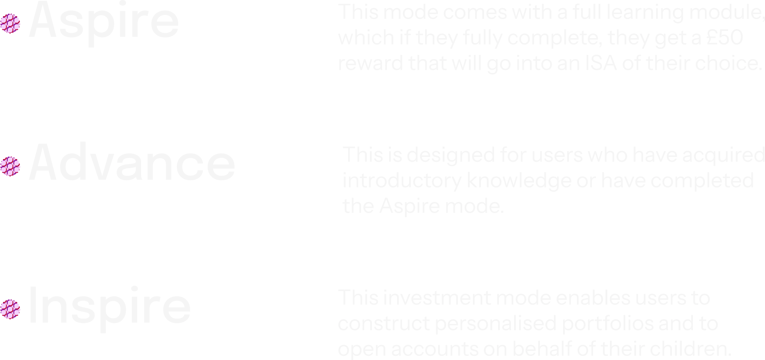
Investment modes
The unique selling point of this app is the different ‘Investment modes’. This structure is created to align investment functionality with users’ evolving levels of financial knowledge and behavioural readiness. This framework is designed to provide a personalised experience that is tailored to users’ varying ages and levels of investment experience.
Prototype
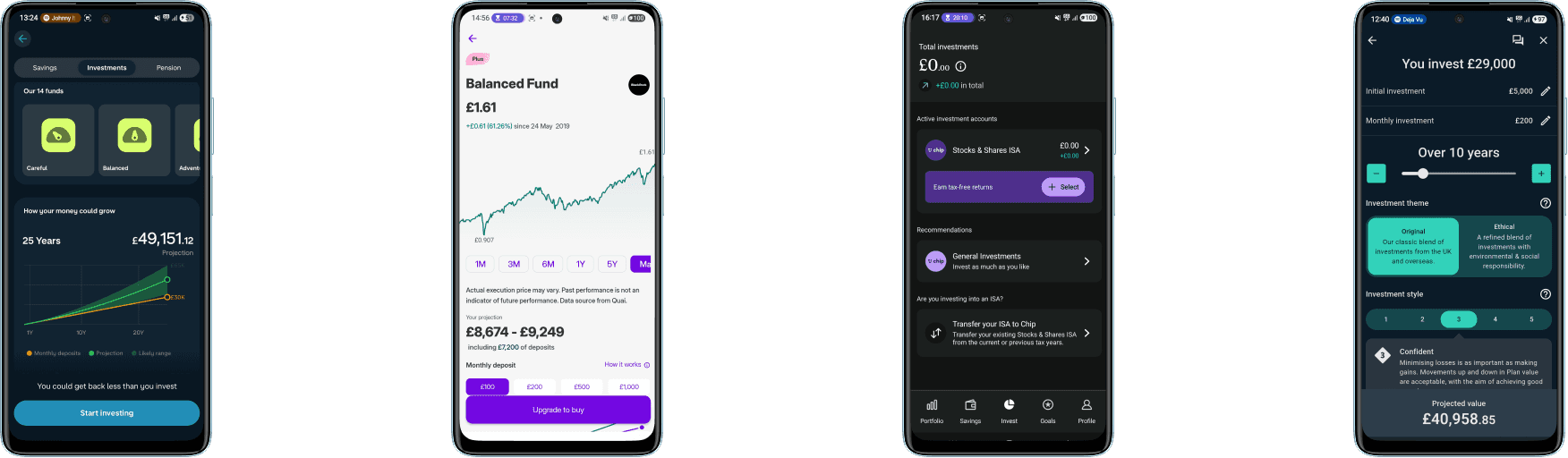
I wanted to make sure that content was digestible and concise, so I alternated between diverse card and accordion layouts - while keeping the design consistent.
The onboarding questions were very important to the user journey. All questions were provided with a ‘Why is this being asked?’ button. This will trigger an overlay pop-up with explanations for each of these questions, so that the user knows it’s relevant to their experience.
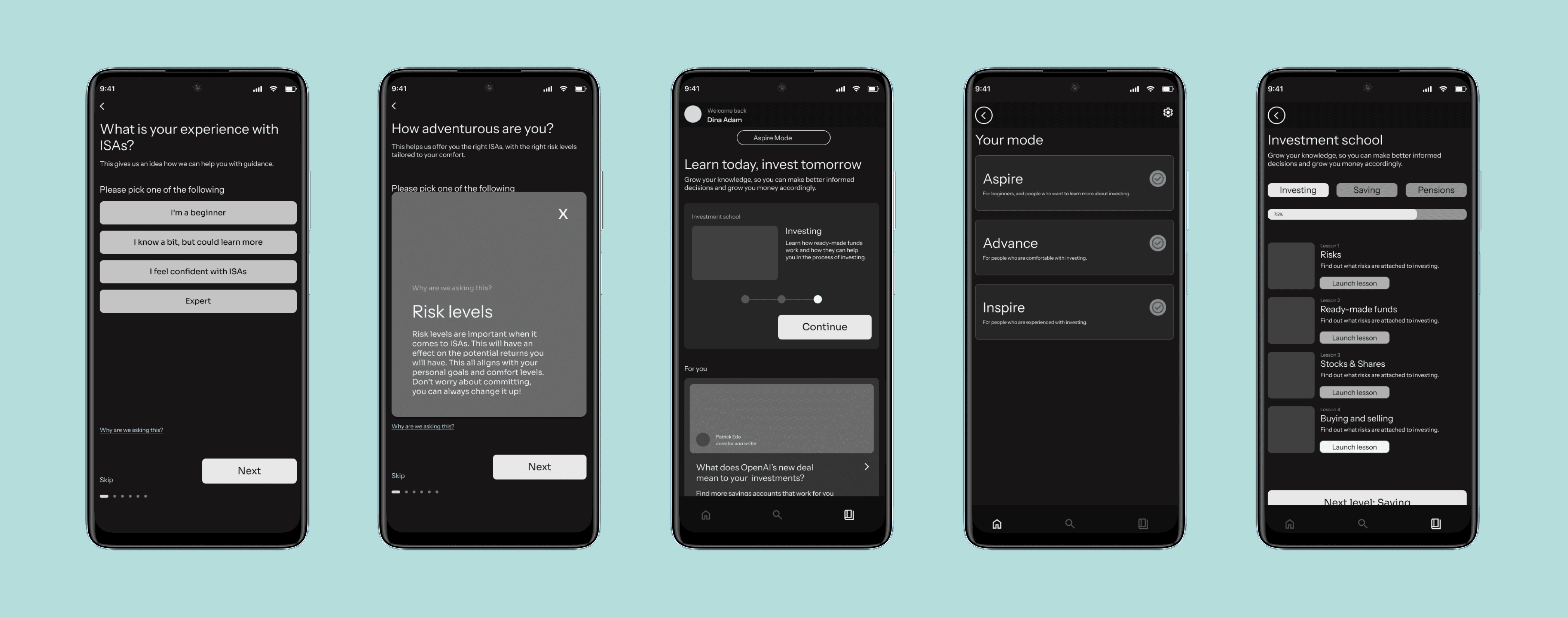
I looked at apps such as Spotify, LinkedIn and Youtube, they implement multiple navigations at the top and bottom. To declutter a bottom navigation, I took a similar approach.
User Testing
The first round of user testing was conducted using the wireframed user journeys with three participants. This provided valuable insights that guided the design in the next phase of the development of the app.
Some key-takeaways:
Figure out variables/conditionals to fix the bug
Use words to differentiate bottom navigation buttons
Create a savings page/card
Make the difference between ‘discover’ and ‘learn’ page clearer
Add accessibility question in onboarding stage
Create a clearer ‘invest now’ CTA
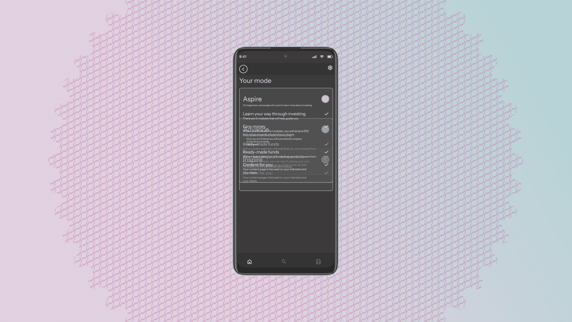
During testing it became apparent there was a bug in the accordion for selecting a different mode.
Final Design
View the final prototype here
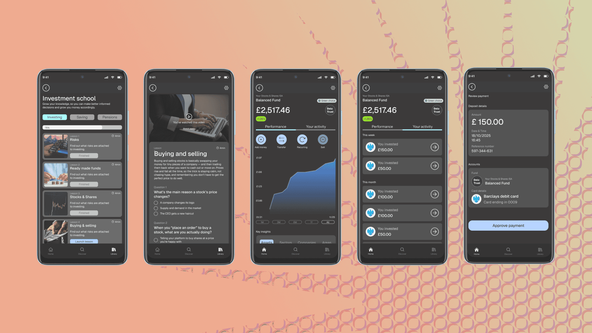
After user testing, I made the needed amends and made sure all the features were aligned with the required solutions. The new designed discover page: this page consists of only articles and news. This would be completely tailored to the users preferences. New learning page: ‘library’ turned into ‘learn’ and here the user can learn from experts in short video format, or if they are in the ‘Aspire’ Investment level, the user can be directed to investment school.
Other improvements that were made:
Savings page and cards were made more visible
Words on the bottom navigation to guide the user
Clearer "invest now" CTA
Accessibility questions in the onboarding stage
Bugs fixed
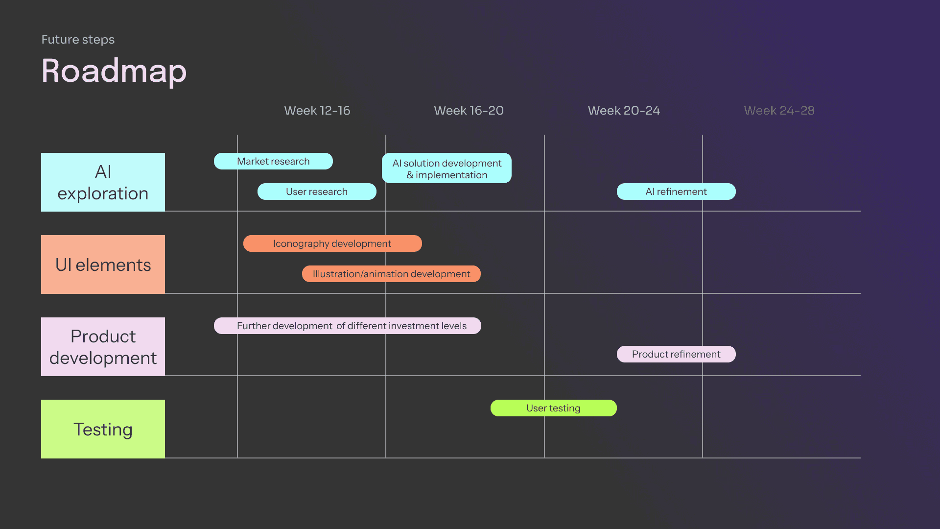
Reflection and future steps
This project was facilitated by GCU and Barclays, who provided us with this brief. Massive thank you to the lecturers at GCU and the UX team at Barclays who guided the process and invited four of us to present our project at their HQ in Glasgow. This project allowed me to develop an app from scratch, by applying the Double Diamond process.
For future steps I would implement AI technologies, further develop UI elements, do more testing and develop other modes of the app. Please see the roadmap below.
Cheers!