Abacus Translation
A redesigned website for a financial translation company with the focus on promoting an e-learning about AI translation.

Project Overview
Client: Abacus Translation, a financial business translation company based in the Netherlands
Industry: Translation, AI
Tools: Figma, Wix
Timeline: 6 weeks (2026)
My Role: Visual Website Designer, Brand Designer, UX Designer
Abacus Translation is a Dutch - English translation company, focusing mostly on business and financial translations. The company needed to modernize their website, branding and promote a new e-learning course. The existing site was outdated, difficult to navigate, and did not effectively highlight their new digital offering.
My role was to redesign the user experience using Human–Computer Interaction (HCI) principles, ensuring the new course was clearly promoted while improving the overall usability of the website.
The problem
The existing website suffered from several usability issues:
Outdated visual design that reduced credibility
Poor information hierarchy
The new e-learning course was not prominently featured
Navigation was confusing for new visitors
These issues made it difficult for users to quickly understand the services offered and discover the new learning product.
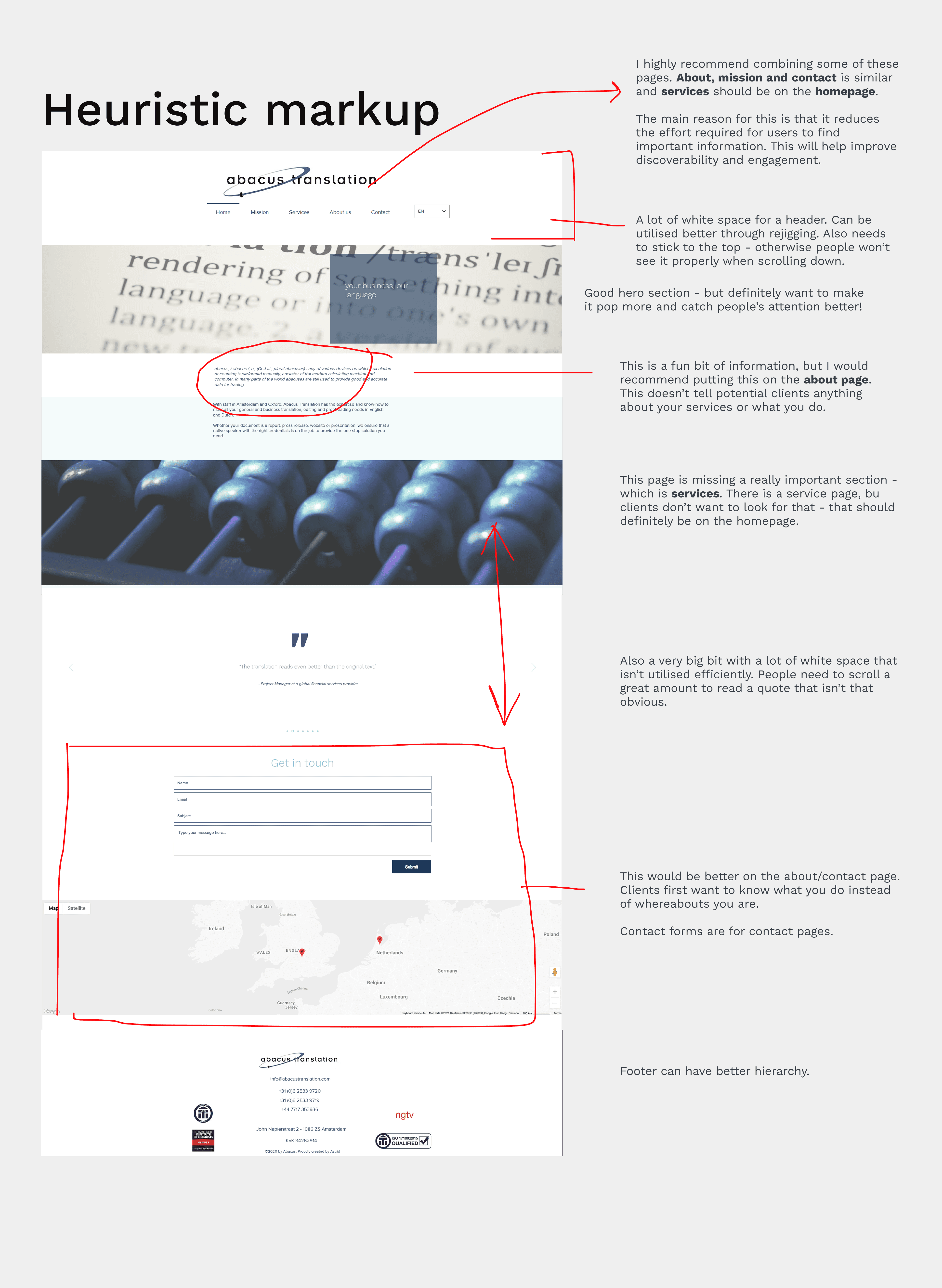
The Research and Discovery
I conducted a heuristic markup of the existing website using established HCI principles.
Key findings included:
Lack of clear calls to action
Weak visual hierarchy
Important information buried in dense text
The e-learning course and services not visible from the homepage
I also conducted an interview with one of the key stakeholders to see what frustrations they had in terms of the website and found that the SEO wasn't optimised either - this was a big painpoint for them.
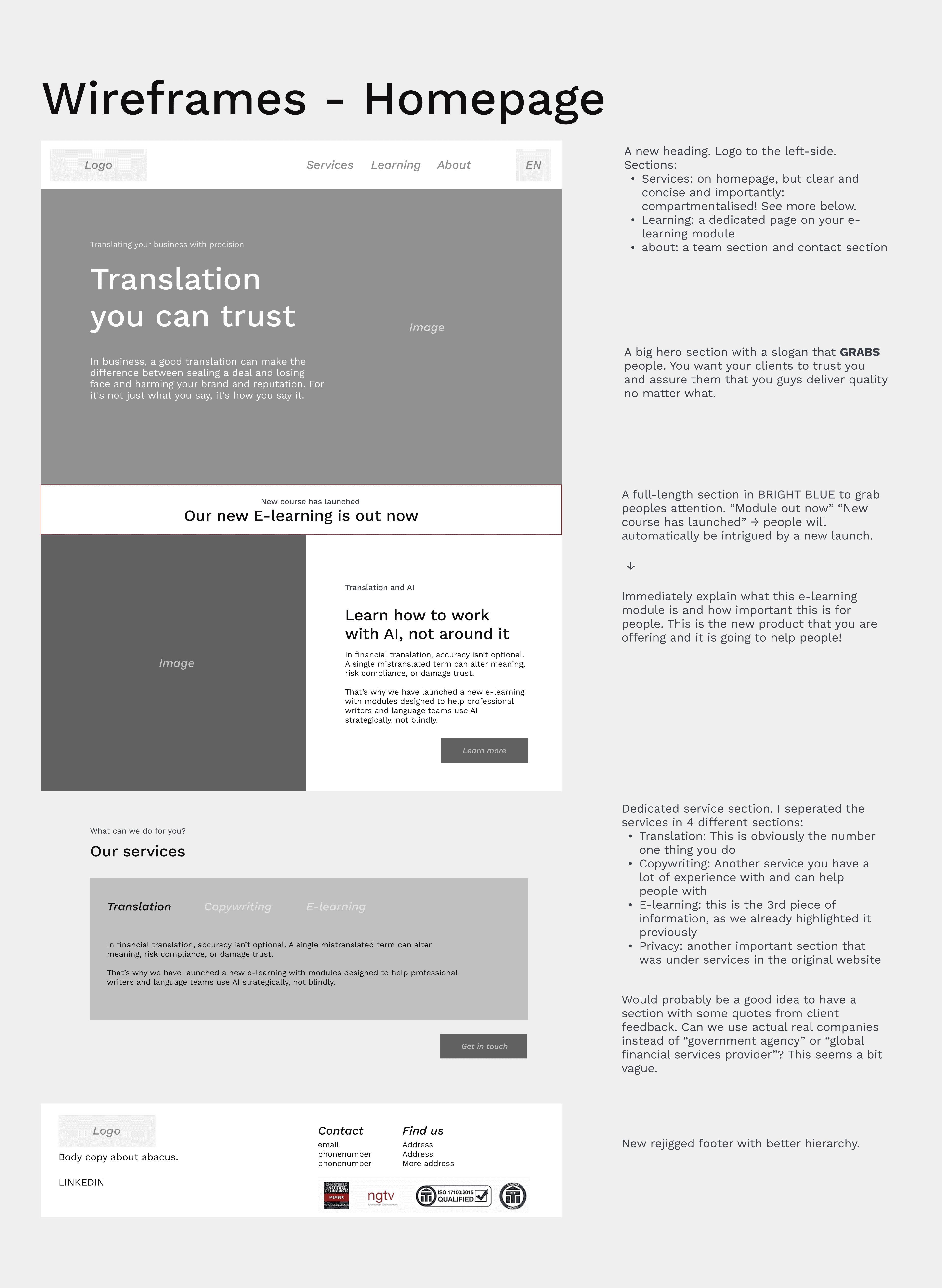
Design Solution
Based on the heuristic markup, I developed a UX strategy and wireframes focused on:
Improving the navigation
Creating clear hierarchy of information
Highlighting the e-learning module with dedicated sections and a new page
Reducing cognitive load through simpler layouts
I used HCI principles such as visibility of system status, consistency, and recognition over recall to guide my design decisions.
Design Process
The whole design process was very iterative. I worked closely with stakeholders to ensure the design aligned with their business goals. Through regular communication and feedback sessions, I ensured the website effectively represented their services while also promoting the new e-learning product. The image below was one of the first iterations, where information hierarchy was still in discussion.

Final product
View the live website here
With the use of better visual elements the redesigned website now:
Presents a modern and credible online presence
Clearly promotes the new e-learning course
Provides a simpler and more intuitive user experience
Makes it easier for clients to understand the services that they offer
Has and optimised SEO
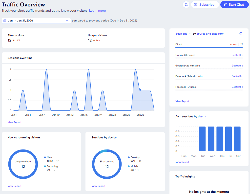
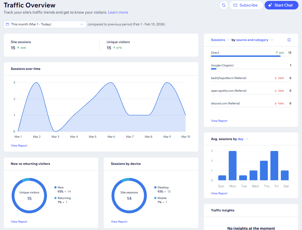
January 2026 Traffic Overview vs. March 2026 Traffic Overview. It's early days, but we can already see an improvement.
Reflection
The project allowed me to apply HCI principles to improve the usability and the structure of a real-world website. By evaluating existing experience and redesigning key areas, I focused on reducing cognitive load and improving the discoverability of information.
I aligned user needs with business goals and clearly communicated my design decisions with stakeholders involved throughout the process.